From Data Chaos to Business Clarity: How Analytics Drives Smarter Decision-Making
In today’s data-driven world, businesses are sitting on a goldmine of information. Every customer interaction, transaction, and operational process generates data, creating endless opportunities to gain insights. Yet, for many organizations, this abundance of data feels more like chaos than clarity. Without the right tools and strategies, data remains an untapped resource, hindering businesses from achieving their true potential.
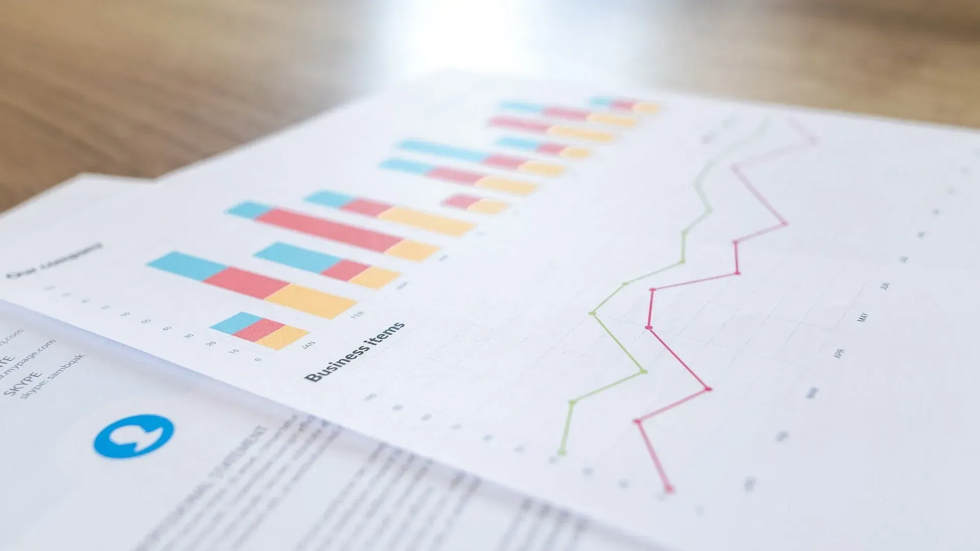
At Arctic Analytix, we believe that the right analytics tools can turn data chaos into a competitive advantage. By harnessing the power of platforms like Tableau, businesses can unlock smarter decision-making, streamline workflows, and gain actionable insights.
The Challenges of Data Overload
In 2024, the average business generates more data than ever before, but most of it goes unused.
•Complexity: Data comes from diverse sources, including CRM systems, social media, and IoT devices. Integrating this data can feel overwhelming.
•Lack of Access: Many organizations struggle with siloed data, where key information is scattered across teams or locked in inaccessible systems.
•Time Constraints: Without the right tools, analyzing data manually is time-consuming and prone to errors.
These challenges lead to missed opportunities, slower decision-making, and a lack of clarity on business performance.
How Data Analytics Brings Clarity
Data analytics platforms like Tableau turn this chaos into actionable insights by:
1.Centralizing Data: Tableau integrates data from multiple sources into a single dashboard, making it easier to visualize the big picture.
2.Enabling Real-Time Insights: With dynamic dashboards, businesses can track KPIs in real time and respond to changes instantly.
3.Promoting Collaboration: By democratizing access to data, Tableau empowers teams across departments to make data-driven decisions.
Transforming Business Decisions with Tableau
Let’s consider a real-world example: a retail company using Tableau to analyze customer behavior.
•By visualizing purchasing trends, the company identifies its best-selling products and adjusts inventory accordingly.
•Insights into customer demographics allow for more targeted marketing campaigns, leading to increased sales.
•Automated dashboards free up time for analysts, who can focus on strategic initiatives rather than manual reporting.
This is just one example of how data analytics can revolutionize business processes, drive growth, and improve profitability.
Why Arctic Analytix?
At Arctic Analytix, we specialize in helping businesses unlock the power of data analytics. Whether it’s implementing Tableau, training your team, or designing customized dashboards, we make analytics accessible and impactful.
Our tailored solutions have helped businesses across industries:
•Optimize operations: Streamlining processes through better data visualization.
•Improve customer experience: Using insights to anticipate customer needs.
•Drive strategic growth: Identifying opportunities through predictive analytics.
Your Next Step to Data-Driven Success
Data doesn’t have to be overwhelming. With the right tools and expertise, it becomes your greatest asset. Arctic Analytix is here to help you turn data chaos into business clarity.
Ready to make smarter decisions and gain a competitive edge? Let’s talk! Contact us today to learn more about how Tableau can transform your business.